LATITUTES
Latitutes travel app is a complementary app to the on-line, web based, monthly magazine. It was born out of the need to keep the engagement with our audience at a time where content consumption on desktop and laptop were in decline and mobile / tablet devices were taking their place. At the time I was working as one of the designers to produce the monthly on-line magazine and had the opportunity to get started on this new project.
DISCOVERY PHASE
By using Analytics and Traffic data it was clearly visible that a sizeable chunk of traffic was incoming from mobile devices: phone and tablets. This was a problem (pain point) as the on-line monthly magazine was developed in Flash and as such, it was incompatible with those mobile devices. Additionally, the bulk of the traffic was around 5 pm to 8 pm, when people would return home and would have access to a desktop or laptop.

Traffic volume
Volume of traffic, averaged per day, on the web platform
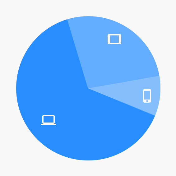
Usage breakdown
Breakdown of traffic based on type of device
ARCHITECTURE
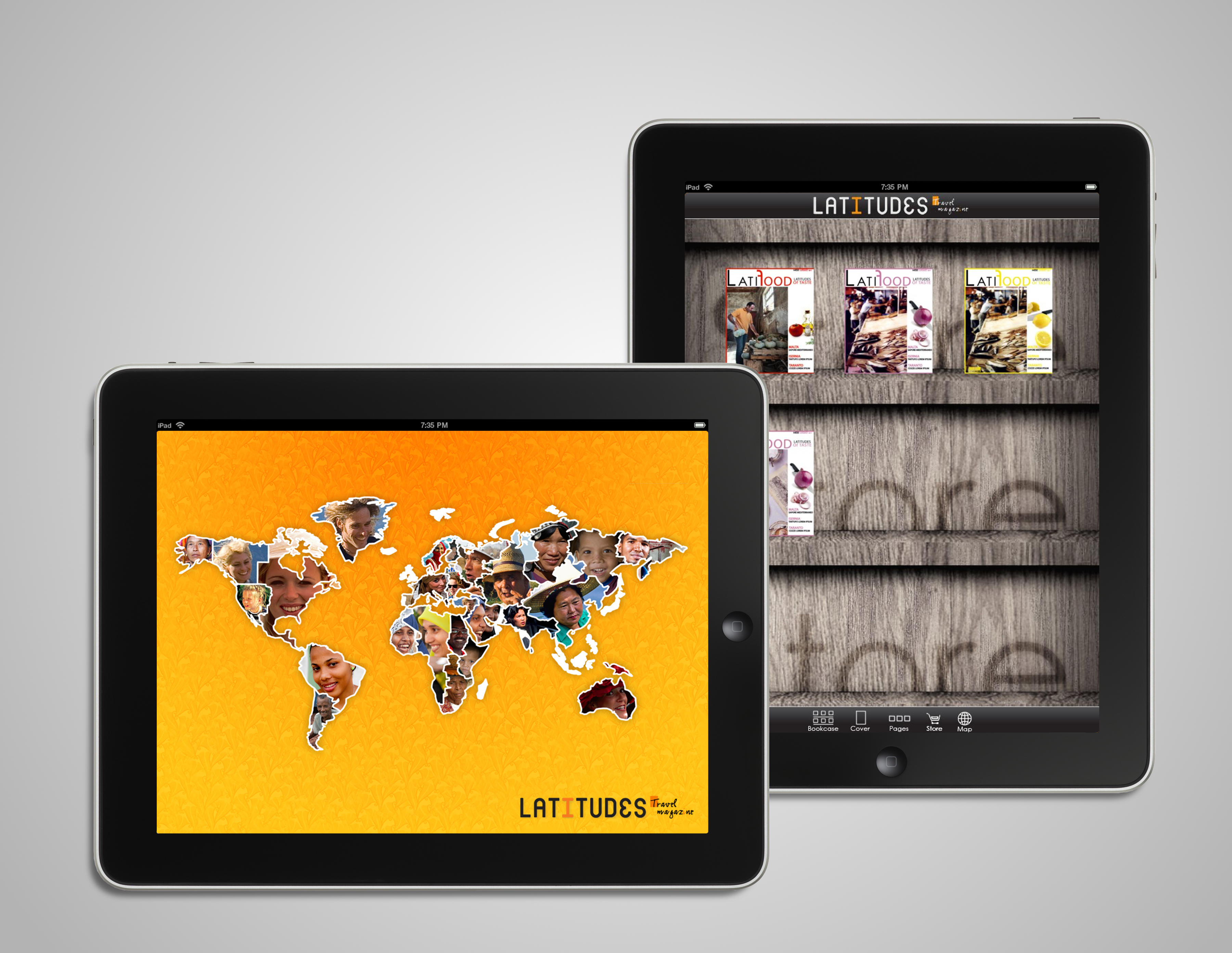
Because of short time and resources we focused on very few functionalities. Additionally we targeted only 1 device type: iPad.

STRUCTURE OF AN ARTICLE
In order to keep flexibility and consistency I decided to have 4 type of components in order to build articles: "Opening" of an article, "Continuation" of an article, "Full picture" with caption and "Closing" of an article. Also the same layout needed to work in landscape as well.
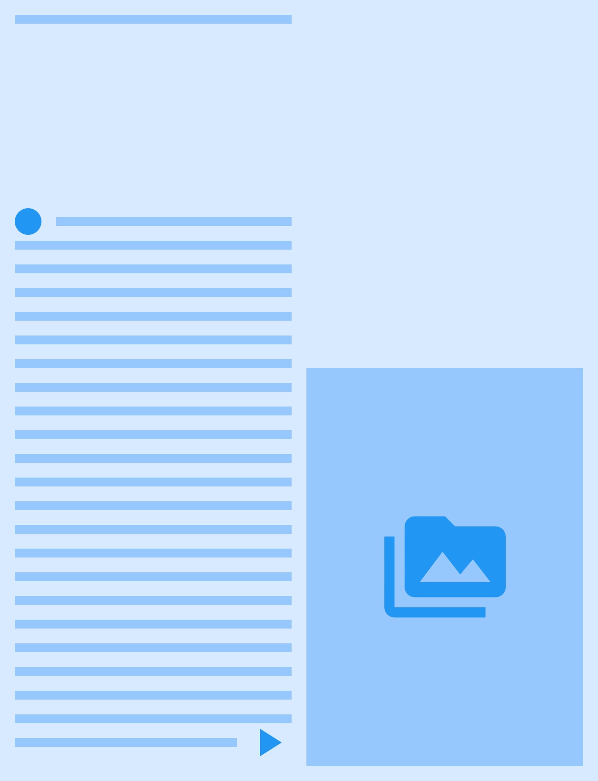
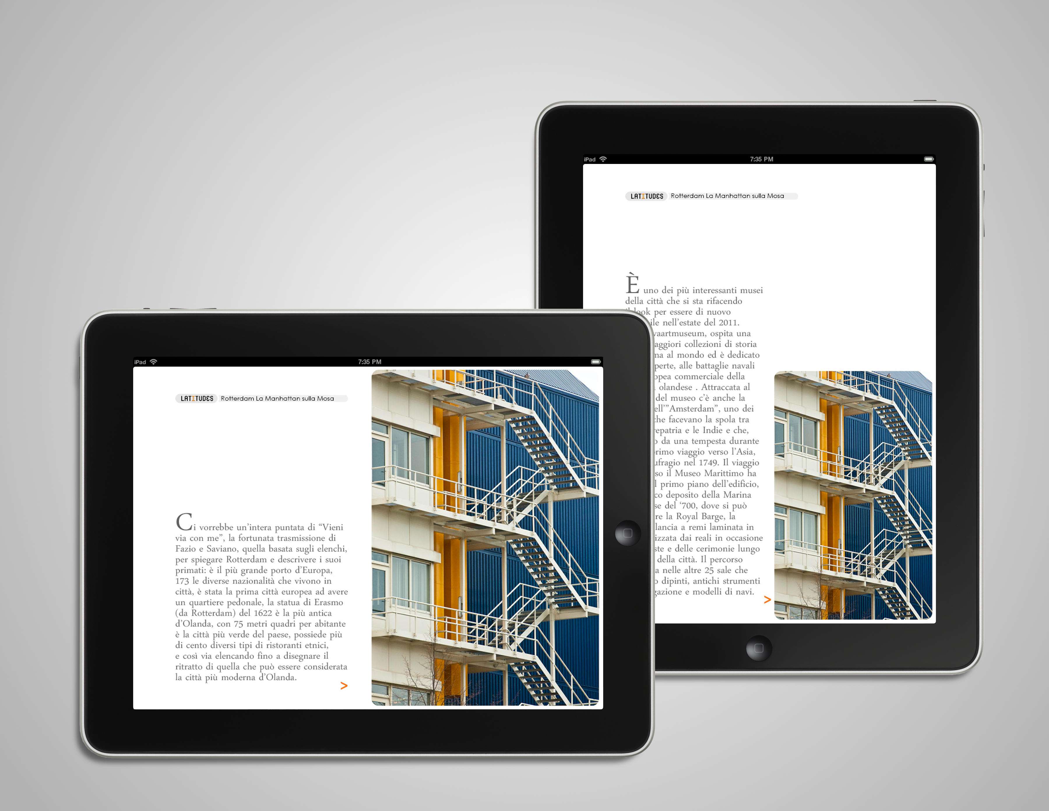
Opening of an article
The article opening is distinguished by the capital letter on the article. It would have a triangle-arrow to symbolize the article continued.

Continuation of an article
This page would not have a capital letter and the article continued from the previous page. It night also have a triangle-arrow to symbolize the article continued.

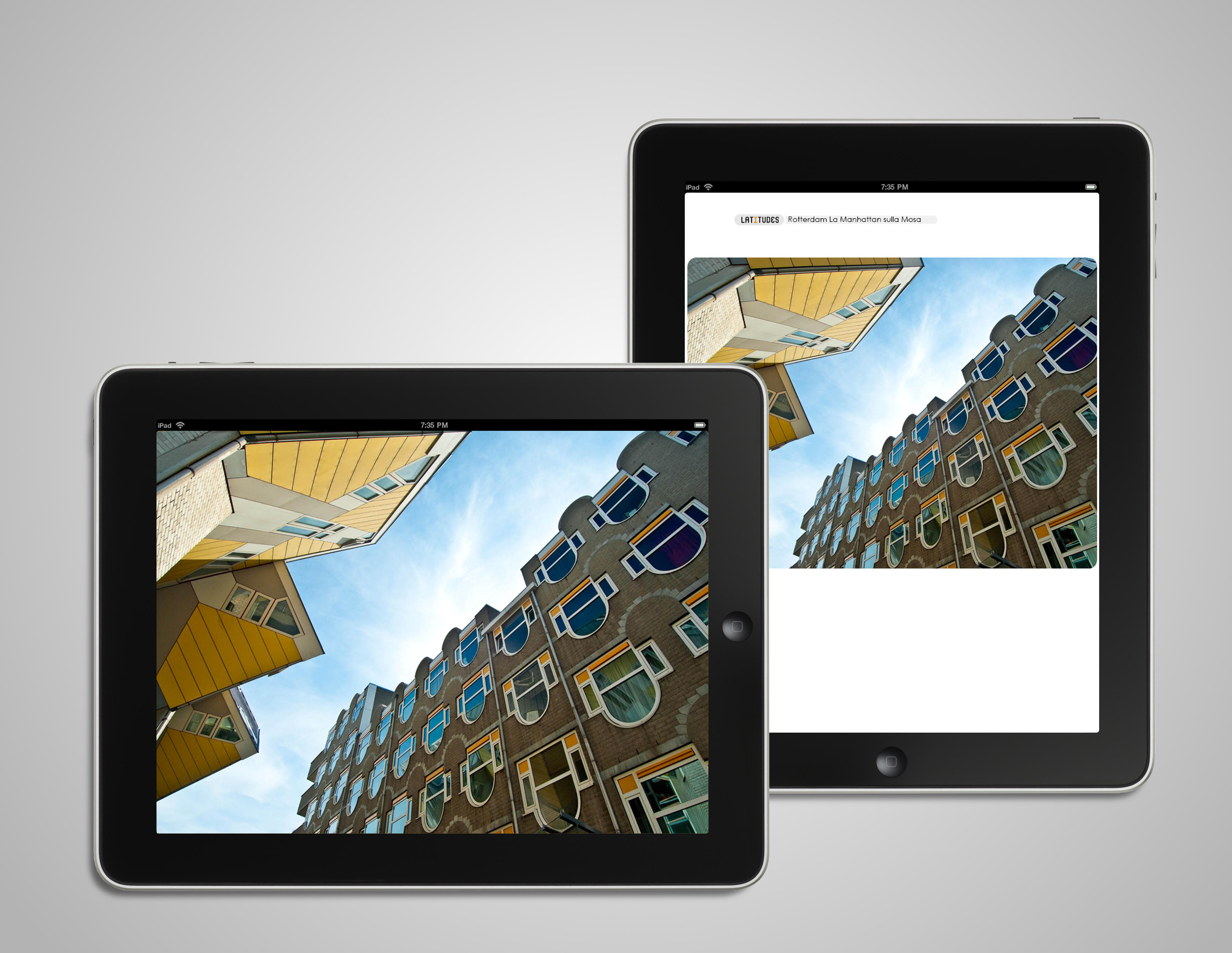
Full picture
A dedicated page to a picture particularly important in the context of the article.
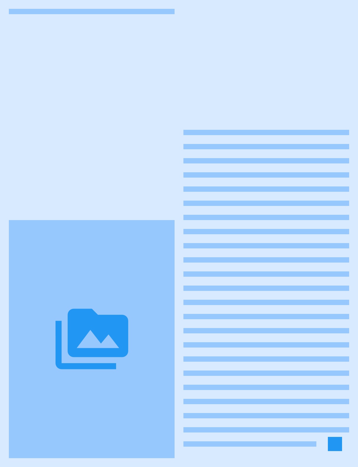
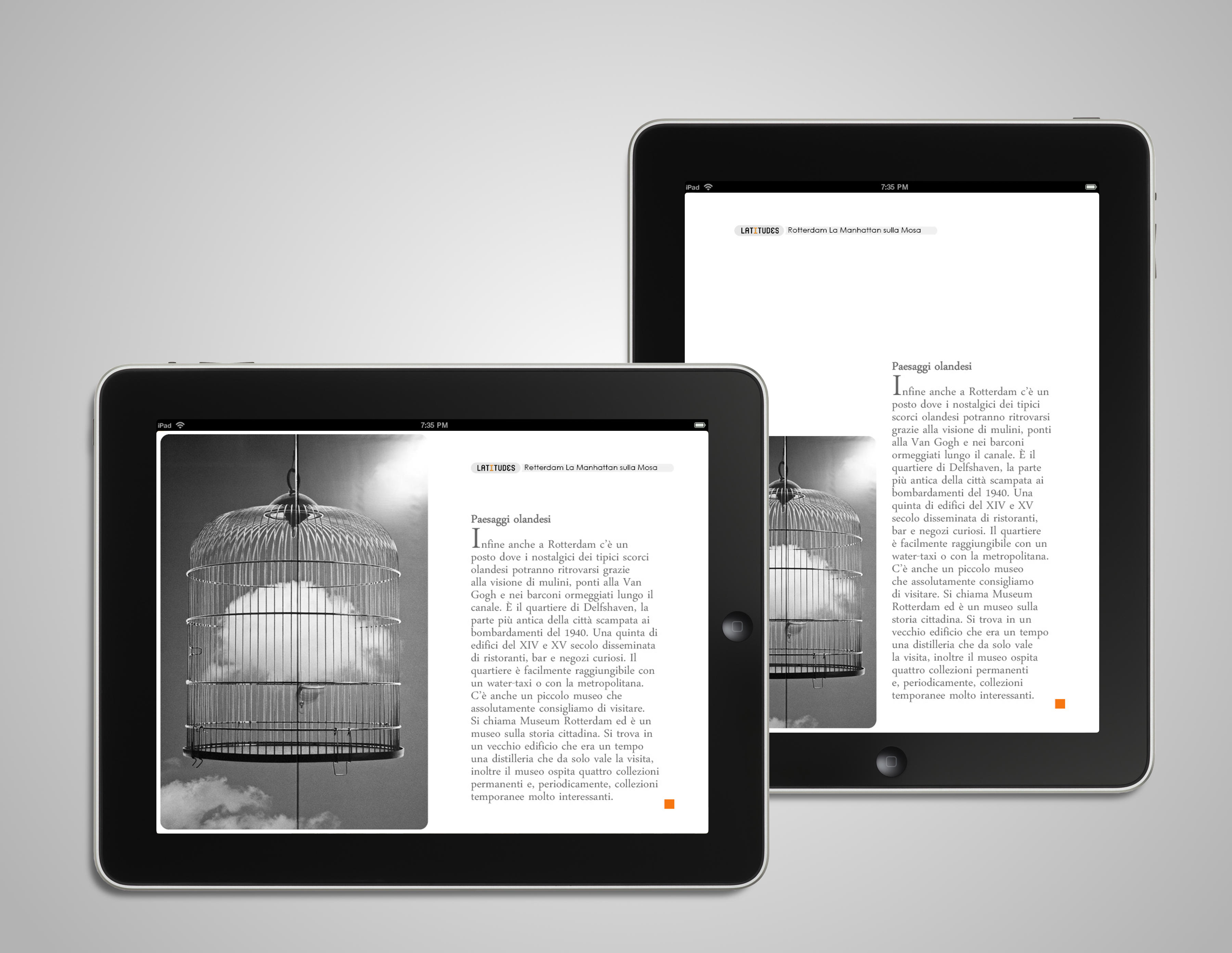
Closing of an article
A closing article would terminate with a full stop (square). An article could start and end within the same page, however unlucky.
DESIGN
Below samples screens of the final design. The Opening page and the Continuation page are exactly the same with the only difference that the paragraph might start on the first page with an "initial" (drop cap) and the Continuation
CONCLUSION
The app today is still maintained and used. I don't have statistical data on the app (as I don't work there) but the fact that new content is still published today is a testament that it's doing its job.
You can access the app here